Chat about Candy Crush Saga, share thoughts, news, or anything sweet!
Support - Stuck or having an issue? Ask a question and get help from other players!
Enter for a chance to win Gold Bars and sweet in-game rewards in Candy Crush Saga!
This is your chill zone! Talk about anything that’s not Candy-related with other Candy players!.
Have a sweet suggestion? Share your ideas to help improve Candy Crush Saga.
...
Sign in or register to leave a comment and join the conversation.
I might be missing something here @christinewupp but I found the new post easy to find.
but if all that shows up now is the accepted answer
That isn't the case though. A new choice has been added to answered threads that allows you to choose between viewing the whole thread or just the answer.
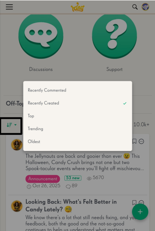
@christinewupp sorry about that, many terms to remember! Recently commented to recently created
Hi again @christinewupp! We're absolutely investigating ways to improve the search function, this is a really good problem for us to have - as the search bar has the same functionality as before (nothing has been edited with the new layout) but now we see players taking advantage of it!
Yes it is a mess @MannyFae really don't know why this one reply isn't enough, then it would only be one reply they'd have to fix the notifications on. Guess we'll just have to wait and see if the Subthreads stays, like I said I won't use it 🙄
Forgot to say, yes it did generate a notification being as it's my thread.
I think the suggestion by Fluffy Dinosaur to put it to a vote if we want to see "recently commented" as the default is ridiculous. Who is going to vote on this? There's nobody around to vote as no one can navigate their way around the site to find anything.
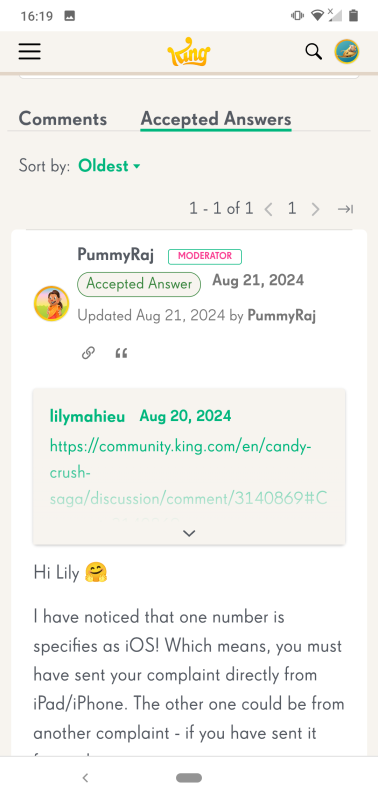
One thing that actually needed changing, and in view of these recent changes even more so, is the search function. People do use it and when they do they think the way to communicate and get help is to add a comment to that thread, not noticing it is old. As a result their post and their call for help gets buried and lost and no one is going to help them. Here is one example. Can anyone find the new post in this thread?
The search function needs to guide people to the appropriate thread in which to comment. That is not some old thread that effectively is now closed, like the one above. I know this has been mentioned here before, but if all that shows up now is the accepted answer, then the comment box needs to be removed from these threads so that these old threads are "read only" !
Thanks Carol! I wouldn't have known that FluffyDinosaur had commented if not for your tag. Also, it took me some time to find my own post. 🙃 What a mess.
Does this reply generate a notification? It should since this is your thread.
And this is what I mean about the Reply (Subthreads) messing up the flow of the thread. Because I'd started the thread I was notified that @MannyFae @christinewupp @FluffyDinosaur had commented. I pressed sort by newest but that was still the post on 27th October by @QueenB
So now it's scroll, scroll, scroll until you find it, messy 🥴
Not my cup of tea ☕
I'm not sure I understand. You said you have changed from "recently commented" to "recently commented" @FluffyDinosaur
Hi Christine, Thanks so much for all the feedback! I especially was interested in this part:"The default is "recently created" each time we open the website. This shows few new threads, even from yesterday. A newbie would think none of us were interacting here, what a waste this place is. If the default was "recently commented" then the opening page greeting newbies would look a lot more active and interesting." We actually initially set the default to be "recently commented" but due to feedback from other players, we changed it to "recently commented" instead as players claimed this would make more sense to them. It seems we have a bit of a difference in preference. I'll evaluate with the team what we should do moving forward, perhaps we could do some more testing or ask players to vote 😁
Hi MannyFae, this is super well written feedback! Thanks so much for taking the time to write it. We're currently handling improvements for the layout in two ways: A) Bugs/issues/things that is breaking the forum. This is the main priority for now! B) Long term improvements to navigation, layout structure, and bringing new (and old) fun updates to this new system. Currently our focus is entirely on A), as it is the most urgent - but we are going to continue to work and improve this layout for upcoming 6-8 months. So please rest assured improvements are coming, just one step at a time 😁
Thank you, QueenB. Hopefully, things will improve in the near future.
Thank you. And for the record: I had to click on "newest" four times before I could see your post. Four times! The first three times nothing happened, and the old October 21st posts were all that was visible.
Hi @christinewupp @Carol-38 and @MannyFae
Thank you so much for taking the time to share all this feedback 🙏 I know it’s a big adjustment, especially for those of you who’ve been part of the community for so many years. We really appreciate your honesty and the care you’ve put into explaining what feels different or confusing.
I’ve taken note of everything you mentioned. This new layout is still very much a work in progress, and we’re continuing to fine-tune things based on everyone’s input.
We know the new reply structure and sorting options can make it harder to follow longer threads or find the newest comments, and we’re already looking into ways to make that smoother. The scrolling issue you mentioned has also been reported, and the team’s investigating that too.
This version of the layout isn’t final, we’ll keep improving it step by step to make sure it feels better for everyone as we go.
Appreciate your patience (and your honesty) while we work through it ☺️
@QueenB I agree with all of the comments made here today, especially the points A, B and C made by MannyFae. I have been facing exactly the same issues. Here my take on this, which is basically a repeat of what MannyFae wrote.
I agree that the circles need to be put back at the top of the page. I cannot navigate out of a thread other than by reloading the forum or using the back function on my browser. It's driving me insane.
Newbies are getting lost too, it's not just us.
We can't see if moderators or other experts have answered threads in Support. Sometimes those who ask the question write a second comment and so effectively "answer" themselves, and those posts are often missed by the system. Or they receive a nonsense answer from someone. We used to be able to spot those posts and step in to answer them before the change, when we could see who the answer was by. Now all we see is "answered" and have to check each and every post individually to see if the person still needs help. I'm not sure I'm going to keep doing that.
The default is "recently created" each time we open the website. This shows few new threads, even from yesterday. A newbie would think none of us were interacting here, what a waste this place is. If the default was "recently commented" then the opening page greeting newbies would look a lot more active and interesting.
The default places the oldest comments at the top. These can be really old, like years old. Some people don't notice this and answer those ancient posts by mistake. Newbies coming to this forum will think nobody comments here for years, so what's the point of joining in.
Those two defaults need to change, so that the most recent comments are always seen by everyone who comes to this place. Otherwise people won't come here and this place will die.
The subthread issue is one I can live with. I will myself always now make sure I do not use the "reply" function unless I am writing a personal reply, which is something that we can learn to do. The subthreads are actually quite handy for personal messages you don't want everyone to see.
But I think it is vitally important for the future of this website that the most recent posts in the comments box show up for everyone every time they log into this site.
And once again you express everything I've felt and complained about here eloquently. What a brilliant summary!
🤣😂 @MannyFae seems we were bashing away on our keyboards at the same time, let's hope someone takes notice 🤔
Well I've had a good old try with the new update @QueenB that was designed to make our experience smoother, friendlier, and more fun especially on mobile. Unfortunately I still can't see how the designers feel this is better. Was it done with the help of many who are actually active in the Community or just someone thinking this would be an improvement. I think the majority of us are up for change, but sadly this has been a change in the wrong direction. It certainly isn't smoother, friendlier and no way more fun. I read in another post that Elsa is creating a guide, so that will be interesting to see.
But being one who can never keep her trap shut (one of my mums sayings) here goes.
It's still the same that when we log in we click on which game we want to go to. And still the same that we click on Discussions, Support etc. But what is the actual reason for
As when using the old system we could see what posts had recently been created, they were always at the top. Then any posts commented on automatically got moved to the 1st page. I've tried Top, Trending and Old and can't see how that's helpful, hopefully someone will tell me.
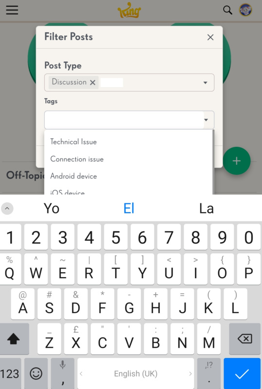
Also I've yet to discover what this is about
As my keyboard sticks over it, so I can't see all the options.
As for the Reply - subthreads - that completely throws the flow of the thread and newer comments could be placed a lot lower down and missed. Also the Reply doesn't seem to send notifications like the Reply on the older style.
I appreciate there is still more to be done, and hopefully it will be tidied up, but as it stands at present it's certainly a step backwards and rather off putting.
Oh well we'll wait and see what happens in the future and hope it doesn't put too many of us off staying 🤔
I've been trying to use this new forum for a few days, and I'd like to share my feedback, @QueenB .
1. Subthreads. I do understand that they appear modern and trendy, but I have to say that they just don't fit in this forum. Compared to most social media, this forum tends to have (or should I say used to have?) longer threads that are often several pages long, threads that stay relevant for longer periods of time, and threads with replies from many contributors. I doubt that the above is sustainable in the new format. It's really, REALLY hard to find a new reply buried somewhere in the subtreads, so it's no longer possible to maintain a proper conversation.
2. Other issues.
A). Forum navigation. The big green buttons (Discussions, Support, etc.) were removed from the top of each thread page, apparently in an effort to unclutter it. However, they are/were a part of the main navigation system of the forum. Now the only way I can get out of a several pages long thread and back to the parent page is to use the breadcrumbs (a string tracing the navigation path from the first page of the site to the current page, for example, Games > Candy Crush Saga > Discussions). It's awkward, and I would say that if the only viable way to navigate the site is by using breadcrumbs, then the site navigation is broken.
B). Sorting defaults. I'm struggling with the 'Recently Created' setting for threads the forum defaults to. This forum has many threads that stay relevant despite being created months ago, and I keep missing new comments in those threads because they don't come up on the first page. The 'Newest' setting for comments is not working for me either, as the latest comment is often hidden in a subthread, so I have to look through the entire thread to find it. This is more convenient when the thread is sorted in a natural (chronological) order. Unfortunately, the forum does not save my preferred sorting choices, and I have found nothing in the settings that would allow me to do it.
C). Missing 'most recent by' info. The name of the most recent commenter was previously visible and highlighted in bold. This was helpful (especially in the Support forum) as it made it clear that someone had already responded to the post.
D). Numerous typing issues when writing in reply, especially on smaller screen devices [already reported, so hopefully this will get fixed].
I assume that the changes to the forum were made to appeal to novices who are not familiar with forums and to make the forum more similar to social media. But I've noticed that new users are now creating multiple posts on the same subject, apparently unable to find the previous one, so the forum must be too confusing for them (and for us too). Also, the number of posts in the Support forum has decreased, so it seems that the new approach is not working very well, I'm afraid. This forum cannot become a social media, but it can cease to function as a forum. I wouldn't want it to happen.
What happened to sweet cinema? Unable to play without boosters
Oh well the good news is they do know about the problem. So hopefully it will be fixed soon 🤞