Chat about Candy Crush Saga, share thoughts, news, or anything sweet!
Support - Stuck or having an issue? Ask a question and get help from other players!
Enter for a chance to win Gold Bars and sweet in-game rewards in Candy Crush Saga!
This is your chill zone! Talk about anything that’s not Candy-related with other Candy players!.
Have a sweet suggestion? Share your ideas to help improve Candy Crush Saga.
@QueenB @LoFiGummy @Snow_Rider
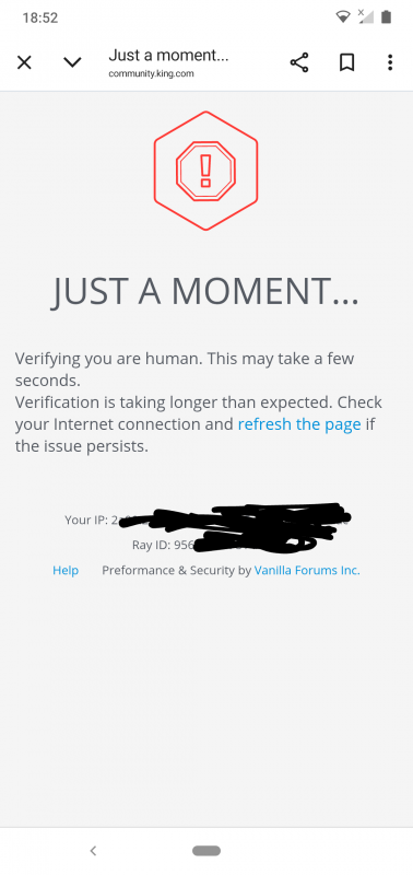
It took me ages to access the forum this evening due to the issue shown below.
Sign in or register to leave a comment and join the conversation.
Hi Alienscar, thanks so much for the feedback! Have you tried using the "hamburger menu" to go back to the area you were in? I mean this one:
This is where our menu has ended up being on mobile 😁
using the back button will take you back to where the icons are still visible
It is not as simple as that though @QueenB and using the back button ignores some aspects of this site. If I receive a notification, when I select the notification to read the post I am taken back to my notifications when I press the back button and not to an area where the icons are visible.
Notification
Select notification to read post
Press back button
Also due to the mess caused by the nested replies when I use the back button I am taken back to my drafts instead of the main board. Nested replies invariably require the use of drafts due to the issue of the box freezing.
how best to display those nav shortcuts
Well surely as they used to display without an issue the solution is obvious.
Hey @Alienscar 👋
Thanks for bringing this up and you're absolutely right, this inconsistency isn’t ideal and I totally get how it messes with the flow when navigating around the community, especially on mobile.
What’s happening is that we’re currently doing some tests with the layout, particularly around the category icons. We noticed that those icons were taking up a lot of space on mobile and getting in the way of content, so we’re working on improvements. That’s why you’ll see them in some areas (like Support) but not others (like Discussions or Contests). The idea was to clean things up a bit visually while we rethink how best to display those nav shortcuts.
That said, we know it’s useful to have them for easy navigation, so they’re not gone for good, we’re just trying to strike a better balance. In the meantime, using the back button will take you back to where the icons are still visible, which I know isn’t perfect, but it’s a workaround while we test out a better version.
Appreciate the nudge and we’re on it… hopeful we can bring a more polished experience back soon 😉
Thanks for the reminder @Alienscar. The issue is not unique to your device. It is always happening on my Android tablets. I will see if this issue can be prioritized for mobile users.
@QueenB @LoFiGummy
The issue of the board headers is still going on. When I read a post in every board other than the Support board I can't navigate back to the board to read another post because the board headers are missing.
In the Support board everything looks as it should.
This site is too difficult to navigate now. Why have the board buttons (Discussions/Support/Contests/Ideas) been removed.
Hi @QueenB
I am using a Samsung Galaxy S24. My current OneUI version is 8.0, my current Android version is 16. But I have had this problem since I started, at least a year and a half. I use Firefox 146.0.1. My tagging issue seems to happen in any comment I try to type.
Hi @Alienscar and @Nobody1 👋
Just stopping by to let you know I haven’t forgotten about the tagging issue you both flagged. I'm now working with our platform provider to dig deeper into it, and they’ve asked for a bit more info to help them reproduce the problem and speed up a fix.
Would you be able to let me know the following when you have a minute?
Really appreciate the extra help here and I know it’s a frustrating one 🙈 Thanks so much in advance!
Ooh, that is good news @QueenB
@Alienscar 🫣🥴 uff so sorry… just reached out again and provided them these images as well, really hope they can solve this ASAP 🥺
@Alienscar I was referring to both!
At least you're able to tag at all, Alienscar. I can only tag people who show up on the list after typing no more than 2 characters. Beyond that and my cursor jumps and I am unable to tag. Sorry - I couldn't tag you for this because of it. :-)
And I agree that so much works badly in portrait mode.
PS:
Aargh! How am I supposed to know who I am tagging
Are you referring to the nesting issue or the tagging issue @QueenB
Either way it is good that something is getting done, but it is a real shame to hear that this wasn't a priority already.
Hey @Alienscar You're going to love the timing on this… I literally lost my patience with this exact issue yesterday, made a screen recording, and sent it to Vanilla 😅
We had a meeting with them and pushed pretty hard to have this prioritized. The good news is they were able to reproduce it and it’s now on their radar as a priority issue. So I'm really hoping we’ll hear something good soon.
Also, thank you for giving us another nudge, fingers crossed we’ll see improvements coming soon 🤞
This isn't fun anymore @QueenB the issue of replying using the nested option is just too hard
It is just a screenshot so what you can't tell is that my screen is essentially frozen.
I can't scroll up or down. I had to exit the post and start again. This has been going on since Oct last year.
Disappointingly an issue I reported in April 2024 is still an issue, so this can be blamed on the new format
Sadly it is yet another example of how landscape mode is prioritised over portrait mode.
It is not so bad when tagging people you know, but when tagging new people it is a real nuisance.
The way categories are structured are currently too large to show more than two buttons on screen
Thanks for the update @QueenB
Part of the frustration caused by the community update is that issues being caused by Vanilla never used to exist even though this forum used Vanilla. The categories all used to fit along the top, so the fact that they don't now means the 'improvement' has failed at a very basic element.
It shouldn't, in my view, require changing to a list or grid view as that never used to be the case. The issue seems to be the placeholder size is far too big for a mobile screen.
It is what it is though and as it has been nearly two months of suffering from the same reported issues I guess there won't be any change soon.
Thanks for flagging this 🧐
I'm trying to reproduce it on my end (I'm on iOS) but not seeing the same thing at the moment. Just to help us narrow it down, could you let me know:
Just wanted to follow up with a bit more context after checking with the team!
Right now, the category header resets whenever switching sections so even if you scroll to “Ideas,” select it, and land on the correct section, the top banner still slides back to the first tab (like “Discussions”), which is confusing. We totally get how that breaks the experience and makes mobile navigation challenging.
The way categories are structured are currently too large to show more than two buttons on screen. The only workaround for now is switching to a list or grid view, but that comes with trade-offs too (like losing the icons).
So yeah, you're not imagining it, and this has been passed on as part of our ongoing feedback. Thanks again for your patience and really appreciate how clearly you’re flagging these pain points 🙏
It is getting harder and harder to use this forum as a mobile user @QueenB
When I navigate to the Ideas board I have to first scroll the board titles to find the Ideas heading.
When I then open the Ideas board the board headings scroll themselves back to show the Discussion board heading whilst I am still in the Idea Board
This makes using the Idea board very difficult as there is no longer any easy way of getting back to the board you are in now after reading a post.
I am truly fed up of Vanilla prioritising a landscape view over a portrait view for mobile users
All of the main Board titles used to fit on screen without the need to scroll. To offer a mobile friendly UI we need that back again
PS: none of the issues in this thread have been resolved yet.