Chat about Candy Crush Saga, share thoughts, news, or anything sweet!
Support - Stuck or having an issue? Ask a question and get help from other players!
Enter for a chance to win Gold Bars and sweet in-game rewards in Candy Crush Saga!
This is your chill zone! Talk about anything that’s not Candy-related with other Candy players!.
Have a sweet suggestion? Share your ideas to help improve Candy Crush Saga.
@QueenB @LoFiGummy @Snow_Rider
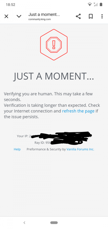
It took me ages to access the forum this evening due to the issue shown below.
Sign in or register to leave a comment and join the conversation.
I'm sure it's been answered before, but I can't find it. My question in my last post re ⬇️
when I open a thread, it opens at page 3 or 4. I then get it back to 1, do whatever and come out, then when I go back it opens again at page 3 or 4.
I highlighted the issue regarding threads opening on old posts back in March @Carol-38. It hasn't been fixed since I mentioned back then.
Ah, so even though mine are all permanently on Newest @QueenB anyway, I still need to click on the Newest. OK let's hope they sort it soon, it must be even more confusing for those new to the Community 🙄
You're not doing anything wrong @Carol-38, I'm having the same experience as well and need to keep sort it by Newest… I've flagged this as well to our provider and pushing for improvement fast 🤓
Being as you've been answering my posts here this morning @QueenB I'll only tag you. I'm sure it's been answered before, but I can't find it. My question in my last post re ⬇️
What's the answer please, am I doing something wrong, or is it all to do with the wonderful Vanilla update 🙃
Following on from my last post @QueenB @LoFiGummy @Snow_Rider it really is getting difficult with this new Vanilla site. The screenshots I tried to attach was a completely greyed out page, where it was trying to load, a page where I was trying to give a response and another one where I got into a thread but it just froze. I got Gateway time-out, Request failed with status code 503, 503 Service Unavailable.
On top of all of that, when I open a thread, it opens at page 3 or 4. I then get it back to 1, do whatever and come out, then when I go back it opens again at page 3 or 4.
I was already typing this when you replied to my other post @QueenB so I'll still send this one.
Also glad you are around, did you read all the new posts in the Wheel of Fortune is a bad idea thread. Did you see my one asking for an update, please say you did and that you will reply soon 🤗🤞
Hi @Carol-38 , thanks for flagging this. Yes, we’re aware of it and Vanilla is aware too. We’ve already raised it with them and we’re pushing for a fix.
We’re really sorry about this. You’re definitely not the only one struggling with it, we’ve been having the same issues on our side as well, so we know how frustrating it is when the site takes ages to load, screenshots don’t show properly, or things just don’t behave as they should.
At the moment we’re waiting for Vanilla to come back with the fix, but please know this is already with them and we’re keeping the pressure on. Thanks again for your patience while this gets sorted.
@QueenB @LoFiGummy @Snow_Rider are there new updates being done with the Vanilla system or is it just playing up, I'm having problem after problem.
For the last 3 to 4 days it's taken ages to actually log in to the site, quite often I give up it takes so long. Then when I do finally get in I get things like
There were three screenshots I wanted to show, attached them but what you are seeing above is nothing like my actual screenshots.
Do you know if Vanilla are doing things or is this another big problem.
Thanks 👍
Edited to say, the screenshots I attached aren't showing when I posted.
Thanks @Alienscar and we get it. We've switched back to the old version until we can improve the new version for mobile! Let me know if you see it ☺️
but I understand that on mobile it can feel less convenient,
It is a shame that is what you understand as the whole update was supposed to
"Tomorrow, the King Community will get a fresh new update designed to make your experience smoother, friendlier, and more fun especially on mobile!"
Nothing about the update has so far proven to benefit a mobile user in any way.
On some devices, switching to landscape can show more of the editor options at once, so that may explain part of the difference you’re seeing.
Yes switching to landscape will show more of the formatting controls, but that shouldn't be the case. I will not use my mobile in a landscape orientation as that is not how they are designed to be used and King has forced everyone to play their game in portrait orientation so they need to be consistent in their approach to design.
Additionally as I hope you can see in the screenshot whilst more of the formatting controls appear in landscape it is impossible to actually comment using that orientation
I use an Android phone
It isn't sitting over the editing area @QueenB as that is the point of my complaint.
The formatting tools disappear under the forum banner (the area that permanently shows the King sign) as you scroll down to write more
Hey @Alienscar , thanks for taking the time to share this.
Yes, this is part of the new editor update from Vanilla. It does bring some added functionality, but I understand that on mobile it can feel less convenient, especially when some options are grouped differently and the layout changes depending on screen size and orientation.
That said, in your second screenshot, the layout doesn’t look quite right to me, especially with how it seems to be sitting over the editor area. Could you remind me which device you’re using for this? And if you turn the phone to landscape mode, do you get the same result there as well?
That would help me understand whether this is just the new editor layout on mobile, or if there’s also a display issue on your device.
Thanks again for flagging it.
I did say I wasn't going to do this anymore, but this is just to annoying to ignore.
@QueenB the new formatting controls is just one more change that is detrimental to mobile users of this forum.
On a mobile the controls look like this.
So, to insert the screenshot above I have to now select the '+' and then the landscape symbol. How on earth are new members supposed to realise that?
The worst thing about the change though that it has caused unnecessary scrolling when writing more than a few paragraphs.
For instance, how do I insert a screenshot now..
It is by far the most user unfriendly change I have seen. It is not conducive to helping or encouraging people to post.
In case you missed my point. To insert the screenshot I had to scroll to the top of the comment box. click on the + sign and then click on the landscape sign. When the formatting controls where at the bottom none of that scrolling was required.
Well lucky you @Alienscar 🙃 except you are accepting 2nd best. The best would be having all 5 including Off Topic on the screen, without having to scroll. Not such a big deal for those who know what's hiding on the right, I suppose, but some don't know there is another 1 or 2 hiding.
As for the tagging overspill, good job you know I've got pigtails, freckles and glasses 😂.
We're now 6 months into the new Vanilla upgrade (if we can call it an upgrade) and it's still worse than the old version. It's certainly stopped many sharing their two-penny worth in the Community, such a shame 😢.
It looks okay on my Android phone @Carol-38
I really wish they would fix the tagging overspill issue when in portrait mode though.
Thanks for the reply @QueenB I actually received notification that you had tagged me👍. This is what I've got now, Contests has managed to squeeze itself in.
Shame Vanilla don't use something like the Olympic Rings, and just put the name in each ring. That would/should fit on the smallest screen.
Yes I know, another suggestion that will be ignored, that's OK I'm used to it now. I just can't help suggesting things 🙃
Thanks for sharing this @Carol-38
It's not supposed to be that much space between the icons so we've had a look and there was an update that changed things so can you check now if it looks better now?
Out of interest @QueenB is the the final result of the buttons for mobile users ⬇️
Portrait mode
Landscape mode ⬇️ that I don't use.
Either way it should be that all the buttons are closer together. I'm sure there are many who don't realise they have to scroll to see all the buttons. And even on landscape the Off Topic isn't showing, without scrolling. If this is the final result, it's a shambles along with the sub thread Reply. Guess your head is hurting 🤕 just as much as ours, but what a mess Vanilla have made of it all. Shame King can't use a different company, maybe Chocolate, Strawberry or Banana. Now that could be a bit more palatable😳.
Also I'm still waiting to see if my tagging is working again, as I didn't receive any notifications last week from those tagging me 🥴. Did send you two posts, but maybe your tags aren't working either 🤔.
The Community has certainly taken a dive for the worse, since the new system was implemented, another 🤕. Got my 🤞 improvements are still being looked at.
What seems to be happening is that the forum remembers the last page you viewed in a discussion, instead of always jumping directly to the newest comment.
That doesn't appear to be the case @QueenB and it is just that every thread that is more than one page long opens on the last page.
If it remembered the last page I viewed it would always open on the first page as the newest comments are now always on the first page.
As an example the post mentioned before now has two new comments.
Obviously the last page I viewed was page one to read the seven new comments posted last time
I open it to read the two new comments and once again I am taken to page two
Hi @Alienscar
Thanks for the detailed example and screenshots. This is actually something we’ve flagged with our forum provider before and we’re still following up on it.
What seems to be happening is that the forum remembers the last page you viewed in a discussion, instead of always jumping directly to the newest comment. That can make it look like some of the new replies are missing until you scroll or move between pages.
I see the same behaviour myself from time to time and I completely agree that it’s not the best experience when you’re trying to follow an active discussion.
I’ll check again on the status from our side and see if there’s any update on a fix.
Are the basic functionality issues that this site is suffering from ever going to be fixed @neeuq @QueenB or is this as good as it gets now?
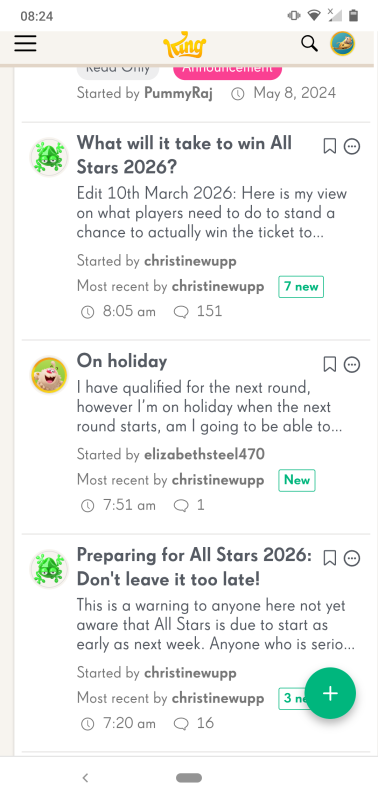
Christine's thread that you can see below shows seven new posts since I last viewed it.
When I click on it instead of being taken to the new posts I am taken to page 2
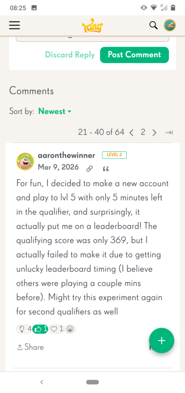
I then have to select page 1 to be shown some of the new posts.
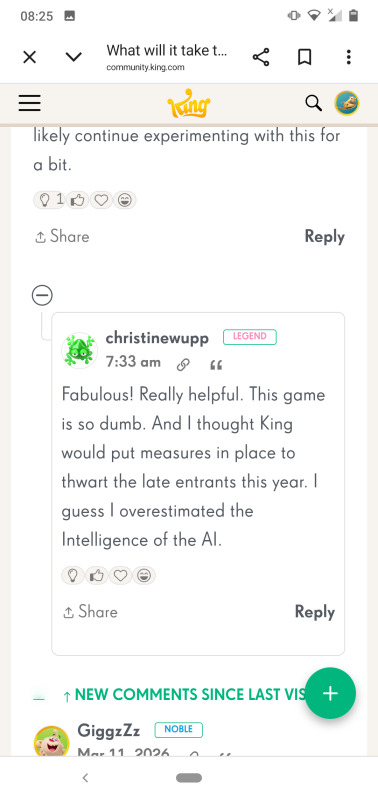
There are only three new posts above the 'New Posts' line though, so where are the other four? Hidden in nested comments somewhere else in the thread, that's where. I now have to scroll around looking for the other new posts which involves reading old posts until I spot something I don't think I have read before.
Being taken to the wrong page of a thread when looking for new posts applies to every thread that is more than one page long. The issue with the hidden new posts applies to every post with new nested comments.
The nested comments do not work QueenB they ruin the basic functionality of this forum, which is communication.
Note that I left another example of an issue that makes this forum frustrating to use. The long running issue of the moving cursor. In my post you can see a failed tag before your tag. This is caused by the cursor moving after I have started to type and as you can see the first letter I typed (q) ended up at the end of the word. This results in a failed tag. It can't be fixed and another tag won't work until I exit my post and come back to via Drafts.