Chat about Candy Crush Saga, share thoughts, news, or anything sweet!
Support - Stuck or having an issue? Ask a question and get help from other players!
Enter for a chance to win Gold Bars and sweet in-game rewards in Candy Crush Saga!
This is your chill zone! Talk about anything that’s not Candy-related with other Candy players!.
Have a sweet suggestion? Share your ideas to help improve Candy Crush Saga.
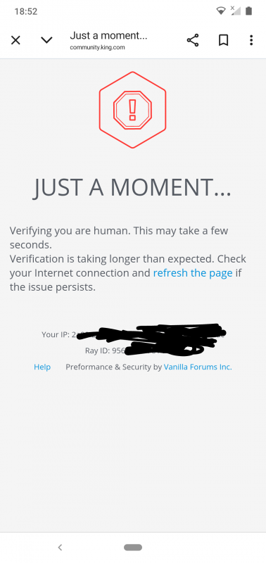
@QueenB @LoFiGummy @Snow_Rider
It took me ages to access the forum this evening due to the issue shown below.
Sign in or register to leave a comment and join the conversation.
Commented threads not bumping to the top of the board: It seems that if someone comments on a thread, it doesn’t rise to the top as expected, especially if it’s a nested comment.
A thread does correctly rise to the top if sorting is manually set to 'Recently Commented'. It's a better default setting because it shows both the most recently created and recently commented posts at the top, and this was the way the forum worked before the redesign. It should be possible to change the default setting in config.
Hi @Alienscar 👋
Thank you so much for taking the time to report all these issues in such detail. I know it takes effort to explain and screenshot everything, and I want you to know that it’s truly appreciated 🙏
You’ll be happy to hear that a number of the things you’ve raised are already being looked into. We’re reviewing a bunch of layout and behavior quirks with the new design, and several of your points match what we’ve got on our internal board. That said, your latest round of feedback also flagged a few new things we hadn’t captured yet, which is super helpful 🙌
Here’s a quick update from our side:
We're compiling this all as part of our upcoming internal review so we can prioritize fixes.
Again, thank you for being so thorough and patient with us. I know adjusting to the new layout hasn’t been easy, but your feedback is helping us make it better and we’re listening.
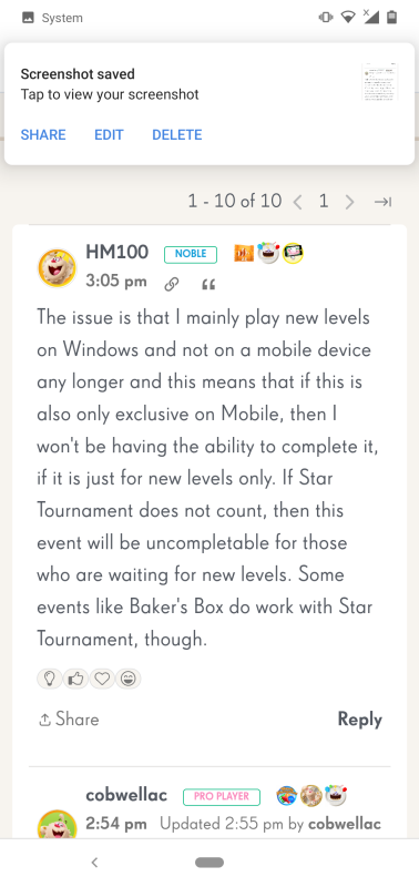
Another example @QueenB of how difficult it is for a new user to navigate and join in with recent discussions.
I have added information to my Issues with Vanilla post. Under normal and sensible forum coding any post that is being actively posted in would/should appear at the top of postings. This new update means no matter how much I post my comment is lost on page 147 of the board.
If posts that are being commented on can't rise to the top automatically without user action then this site is actively surpressing active communication.
@QueenB this forum is a mess
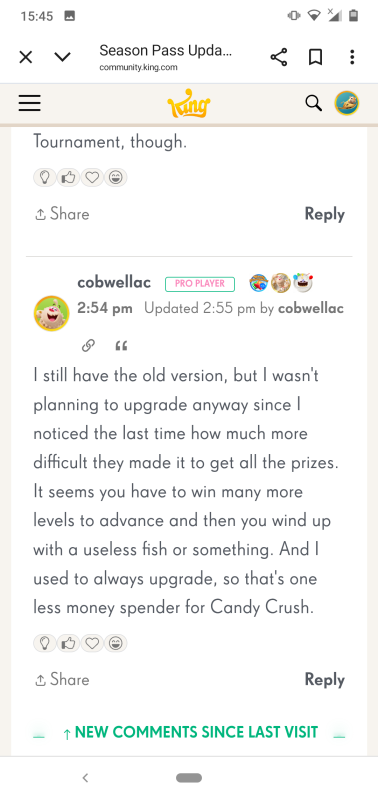
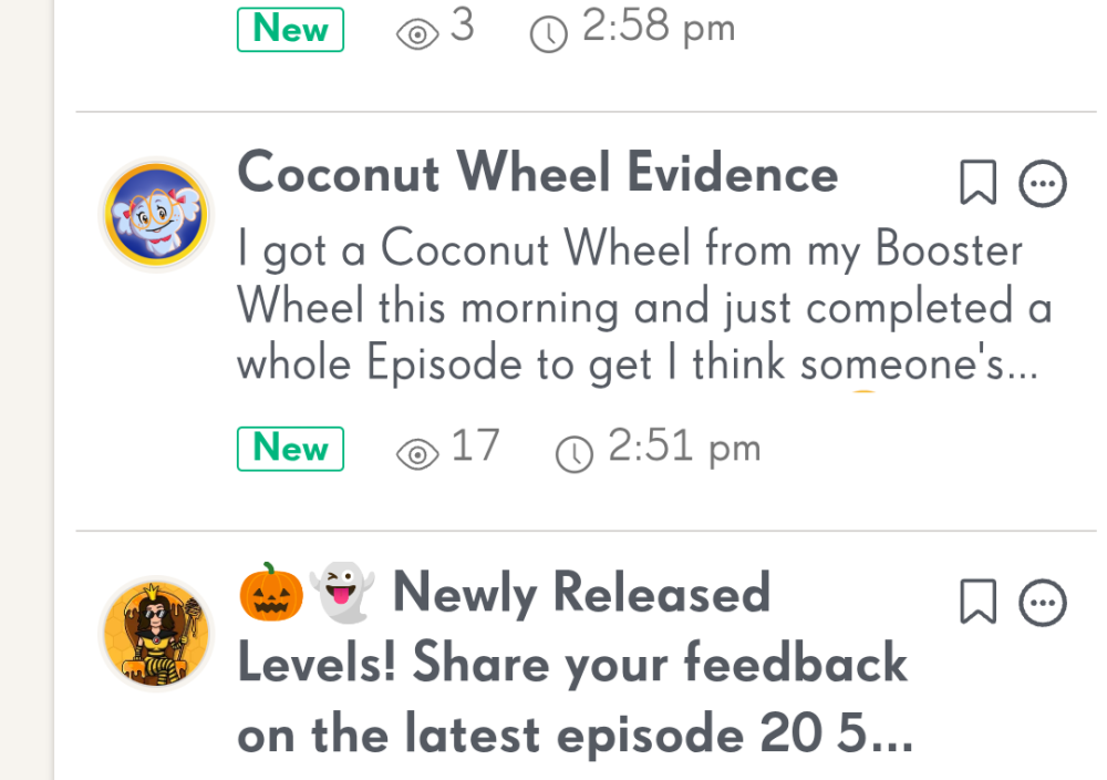
My post Season Pass Update shows 6 new
I open it and there are only three new comments.
As you can see just two new comments and a nested reply.
Also after reading and navigating back to the board the post still displays 6 new.
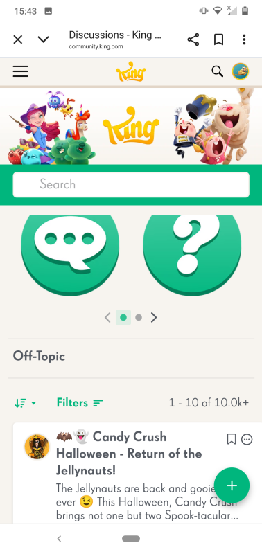
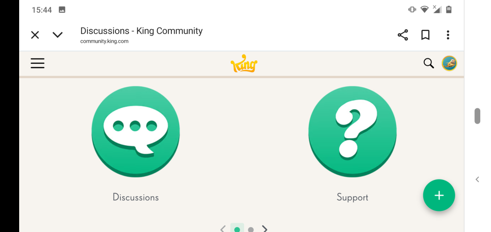
@QueenB another example of how mobile users have been forgotten about with this new community layout.
PORTRAIT VIEW
LANDSCAPE VIEW
How are new users supposed to navigate this forum easily if basic labels aren't formatted to appear correctly in portrait view.
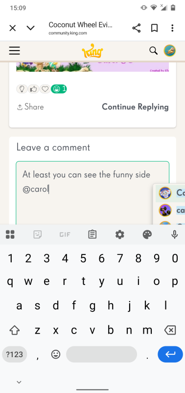
Another issue @QueenB is that a posts status doesn't not update after it has been viewed making it difficult to keep track of posts I have already seen.
Read a post
But when I navigate back to the board view the post is still showing as new.
@QueenB I have mentioned this before but I see it still hasn't been addressed even though we now have a new layout.
Considering this change is supposed to benefit mobile users why is the UI configured for landscape view.
Also are you aware that the comment status doesn't seem to update as it should.
In the screenshot below I have replied to Carol's post, but as you can see there is no indication that I have.
Thanks again for sharing that new instance of the overlap and for including both portrait and landscape views! Super helpful as always 🙌
I’ve passed this onto the team so they can keep tracking any additional cases. The original filter overlap you reported is now confirmed as a known issue, and they’ve added it to their backlog. They’re also monitoring these new instances to see if anything else might be connected.
I’ll keep you posted if I hear anything back 😉
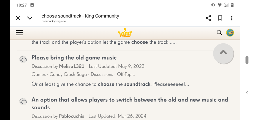
Hi @QueenB I have noticed another instance of overlapping. It is still on the search page but this is slightly different to the first overlap I mentioned.
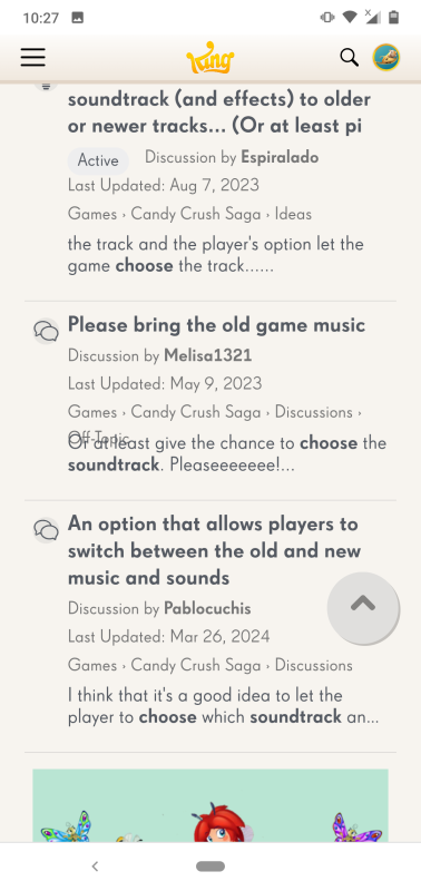
Without using the filters you can see the overlap below. Off-Topic is hidden in the 'please bring the old game music' thread.
This time though the overlap doesn't appear in landscape.
Thanks so much for getting back to me and confirming that the overlapping only appears on the search results page for both of you, that’s really helpful!
I’ve passed the info along to the Vanilla support team so they can investigate further. Since it's Friday, I might not hear back until early next week, but I’ll make sure to keep you both updated as soon as I get any news.
In the meantime, I hope this doesn’t cause too much trouble on your end. Really appreciate your help with tracking this down 🙏
I have only seen it in the search results page so far as well.
Hi @QueenB the overlapping is only occuring in the search results page.
Hi @Alienscar and @Nobody1 👋
The team is continuing their investigation, and they’ve asked for one more piece of information to help narrow it down:
Could you confirm whether this overlapping issue is only happening on the search results page, or if you’re seeing it in other parts of the Community as well?
Knowing whether it's isolated to the search view or more widespread will help them pinpoint the cause and prioritize the fix more accurately.
Really appreciate your help with this and I’ll keep you posted with any updates as soon as I hear more 😊
Thanks again!
Thanks a lot for sharing your browser and device details 🙏 super helpful! I’ve reported everything back to Vanilla Support and just heard back from them. They’ve confirmed that this is a known issue that specifically affects Android mobile devices.
There’s no confirmed timeline for a fix yet, but they'll make sure to update us as soon as they know more.
Thank you again for taking the time to help us report this properly 🙌
Hi @QueenB my browser is Chrome version 140.0.7339.207
I am using Firefox 143.0.2.
Thanks again for reporting the issue with the search filter options overlapping on mobile and for confirming it appears the same in both portrait and landscape views. This has been really helpful in narrowing it down!
The team is currently investigating and has asked if you could also share:
To find your browser version:
chrome://version
No rush but if you can send that info over, it would help us speed things up 😉
Thanks again for your help 🙏
Thanks for this 🙏
We have been able to reproduce the issue on a similar device so it's been reported to Vanilla and will let you know once we hear back 😉
Hi @QueenB the result is the same in landscape
I am using a Nokia 7.1 phone running on Android 10
I do see the same problem as Alienscar. I use a Samsung S24 phone.
To see it, you need to enter a search text, then select the Posts button, then open the Filter Results arrow. If I do that, my screen looks like Alienscar's.