Welcome to the Candy Crush Saga Community
Do you have a question or need help with your game? Ask the Community.
Welcome to the Candy Crush Saga Community
Do you have a question or need help with your game? Ask the Community.

Hi, the NEW Design is not practicable ... it's only in portrait screenmode! I miss the landscape screen mode!!!!!!!! 😬😭😤😡
@QueenB @Diamond_Lim Why mess around with things that don't need touching. It would be best if time was spent getting the game back to an acceptable level, not the product being pumped out now, crammed with blockers, jelly jars, sour skulls, etc, etc !!
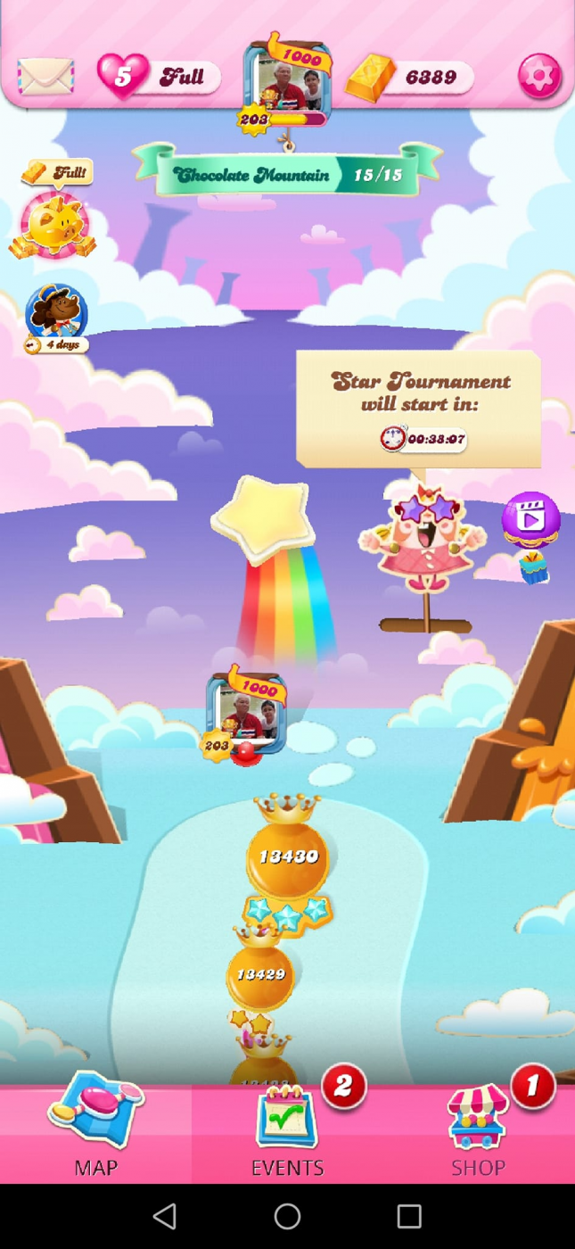
My opinion of the new Saga map - very ordinary.
It looks OK not too bad, if I'm not mistaken it seems bigger, better to see, but if you going to go through all the efforts for a new looking Saga map then at least implement some of the things that players has been asking for so long, for example an easier way to scroll through the game. Other than I'm still getting used to the new look and feel of the map. Keep working on it.
I have not received the new map to date🤷🏻♀️🤷🏻♀️
Kindly, react to my posts.
⬇️⬇️⬇️ ⬇️ TY
I don’t like the new map at all! I play on iPad and prefer landscape orientation. It keeps switching to portrait. I would like the old map back or have the option to choose the orientation.
Well, in my opinion, the old map is not modern, so I welcome the new changes. I respect your opinion, though.
I haven't got it yet and hope I don't. Why keep changing things that don't need changing. Wouldn't it have been easier just to add the down arrow on the original map like we having been asking for, for ages. Seems so much is being changed for the worse, why. Could also do with F5 being brought back.
I think the original map looks a lot more modern than this, to me there's nothing modern looking about it. And as Peter put why spend so much time on this when impossible levels need urgent attention Fully respect your opinion though.
How is it classed as an improved map. It's horrible, just one episode taking up the whole screen. What was the purpose of this change. I don't recall seeing any players complaining about the old Saga Map. Probably need a lot of thought re a scrollbar, might have to have 3, that's 1 at the top 1 at the bottom and 1 in the middle. Won't be much space left on the screen for anything else. And after saying I don't recall seeing any players complaining about the Saga Map, I have seen hundreds maybe thousands complaining on how levels get changed in less than 2 weeks after release making them impossible to pass. So will that get looked at soon.
When I first saw this 3 days ago, I was like 'Holy cow, this is so, so bad! Hope I don't get it!'
Terrible doesn't even come close to describing how I feel about it.
It's very dull - not even remotely as beautiful as the current map. What's next - a 1-colour plain background?
It's much less functional - can barely see a few levels at once, not even a full episode! Scrolling through levels was tedious before but it's a nightmare now.
I won't even mention the portrait view "test" here, although some players seem to think that the orientation bug is related to this insane new map.
This change was totally uncalled for. On the contrary, players have requested the original map back. While I accept the latter may have been too heavy, the new one is extremely unappealing and totally ruins one's gaming experience. As if the bad new sounds weren't enough.
In conclusion, instead if improving the game, you're actually digging its grave. Instead, fix the portrait view bug, add a "Go to" button, fix the full-screen bug or at least add "Back" and "Exit" buttons, implement a chat feature and so on ASKED FOR functionality.
Cheers!